
Seaside Oasis
MOBILE-FIRST WEBSITE
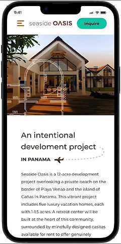
Helping to inspire luxury vacation home buyers with a vibrant building project in Playa Venao, Panama.
Building a vacation home is a time-consuming endeavor. Couple that with the user's desire to find a community that embraces connection and respects each owner's need for privacy, and you'll be hard-pressed to find a service that can help.
Research indicates that many people in the luxury vacation market only have little time or patience to spare. That's where Seaside Oasis comes in - mindfully easing each client's "to-dos" and creating a truly incredible home.
Roles
DELIVERABLES
specs
After a meeting with the stakeholders, I agreed to the following roles in the design and research of this project.
-
UX/UI Designer
-
IxD Designer
-
UX Researcher
-
Visual Designer
-
Responsive web design
-
Competitive analysis
-
User interviews
-
Persona discovery
-
Task and user flows
-
Site map
-
Wireframing and testing
-
High-fidelity prototypes
-
Usability testing
-
Case study with findings
-
Figma
-
Indesign
-
Photoshop
-
Zoom (interviews)

1. Research
SCREENER

The research participants have the primary characteristics:
-
Age 35-70
-
Affluent - have the income to purchase a vacation home
-
Worldly - enjoys traveling and experiencing other cultures
-
Wellness, Growth and Introspective Mindset
high-level goals
Although there were many factors to consider, I decided to focus my research on getting insight into how users from a very specific demographic make decisions:
How do they unwind, and what does a like-minded community look like for them?
I wanted to get inside each of these users' narratives to understand any needs and pain points.
METHODOLOGIES
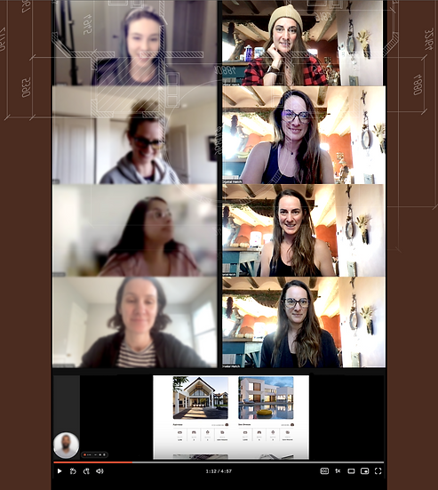
One-on-one interviews both on Zoom and over the phone allowed me the opportunity to gain a better understanding of what their typical routines look like, spiritual practices, and anecdotes of their favorite vacation experiences, along with their not-so-great experiences.
Market research helped me to understand what current competitors were doing that was working well, along with any missed opportunities.
RESEARCH SYNTHESIS
AFFINITY MAP
After I finished the interviews, I found that their responses started to fit within groups. Using an Affinity map, I could pull out specific insights articulated by the users from each topic we discussed.


KEY FINDINGS
Almost all the research participants were very busy, and it was a challenge to find time to connect. After I finished the interviews, I found that their responses started to fit within groups. Using an Affinity map, I could pull out specific insights articulated by the users from each topic we discussed.
INSIGHTS
-
Should be easily accessible by a flight
-
The architecture should be authentically inspired by nature
-
The users are disciplined and routine-oriented
-
They require autonomy
-
Doesn't enjoy group experiences
-
ROI minded
takeaways
This demographic is busy, and so they need a website that is simple to navigate, provides them with a vision and examples and allows them to speak to someone quickly.
User Persona
After synthesizing my research, I used the insights to create a user persona that embodied our specific demographic.
Brian, the growth-minded CEO
Brian understands the importance of investing in something that will bring him more significant financial gain and will help him increase his quality of life while allowing him an opportunity to unwind.
GOALS
1.) To purchase a home that makes sense with a busy lifestyle and offers an authentic place to get away from it all. 2.) To make an intelligent purchase that allows for an opportunity for ROI.
NEEDS
1.) To have access to fresh, local cuisine and the ability to either go out to a restaurant or source the ingredients to make an authentic meal at home. 2.) Plenty of space and privacy from other residents and the ability to opt-in or out of various activities offered in the retreat center. 3.) A unique and authentic property close to the water, inspired by nature with lots of life and high-quality construction and design.
CHALLENGES
1.) Is very busy with limited time, which needs to be respected. 2.) Doesn’t enjoy group experiences, so creating an authentic community where it’s easy for him to partake in the activities that suit him. 3.) Is turned off by pseudo-spirituality and a party-mindset.
MOTIVATIONS
- Wants to get away from the business of work in the city. - Understand the importance of investing in his wellbeing. - Values having balance in his life with fitness, food and opportunities to unwind.
How might we help Brian purchase a vacation home that provides a quality local experience and offers plenty of space and privacy to recharge and practice daily rituals?
2. Information Architecture
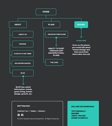
Initially, the stakeholders wanted to include a retreat section for building that part of the community. After talking with the users from their critical demographic, we decided to keep things simple and focus on the needs of those purchasing vacation homes first. Simplifying this way allows us to get to know our key demographic and their unique needs – the retreat section can take form later.
After finding that our users have limited time through the interviews, I simplified the information architecture further. A CTA with the ability to schedule a call for a specific day/time was essential. So, to help assist the user, I kept this in mind when iterating on the site map.

FEATURE MATRIX
SITE MAP (ORIGINAL)

SITE MAP (ITERATION)
3. Interaction Design
Because the goal of this website was simplicity and the ability to get the info with little effort, I decided on the following flows.
USER FLOW
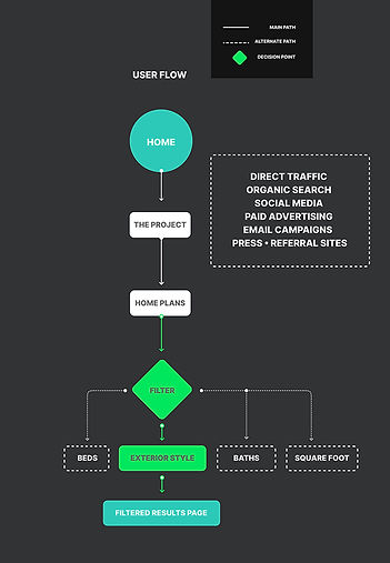
-
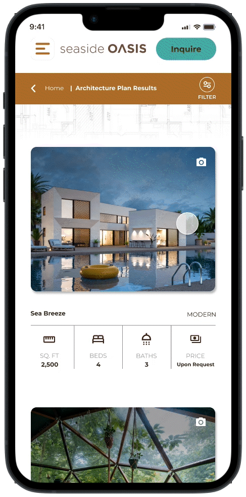
Viewing the home plans through filtering options
-
Inquire and fill out form
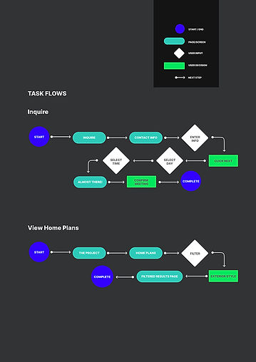
TASK FLOW


4. Branding
LOGO DEVELOPMENT
I used a typeface for the logo because it was more professional and cleaner than including a logo mark.
PROMO VIDEO MOCKUP
After interviewing the key demographic, I created a video montage that also captured their persona and the feeling of the overall project - perfect for the homepage.

All footage from Adobe Stock
5. UI design
COLORS & TYPOGRAPHY
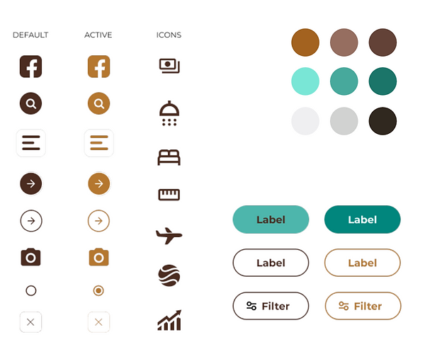
I wanted colors that would reflect the company values of intentionality, authenticity, vulnerability, and curiosity, so I chose to use turquoise and copper in the color palette. Accessibility was also a concern, and using the material design tool helped decide which colors would work well together for the text and buttons. I chose the Montserrat font family because of its geometric design and readability on screens.


STICKER SHEET
HIGH FIDELITY PROTOTYPES
Armed with all the interviews, usability testing feedback, and the chosen branding, I created the mobile and desktop sites in Figma.

Figma Prototypes
6. Iterations
USABILITY TESTING
After designing the prototypes, I tested my task flows again to ensure everything worked as I intended.
FIRST MAJOR IMPROVEMENT
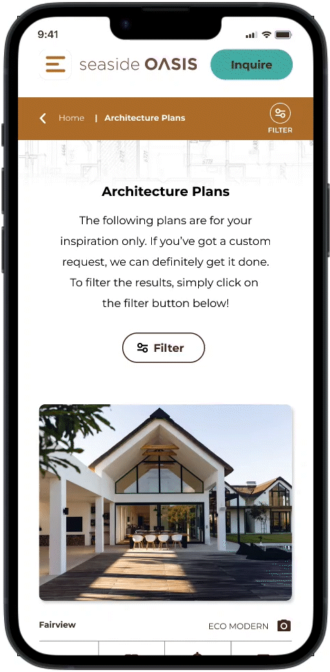
-
I changed the filter feature to allow more functionality and the ability to add more items in the future, along with a sort-by feature.
-
The new filter feature helps to simplify the Architecture Plans page.
-
Added the filter button to the copper bar for better accessibility once on the detail pages.
BEFORE
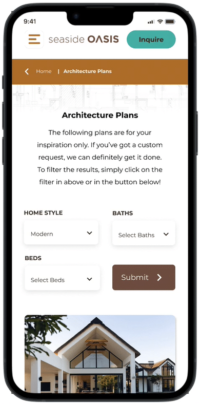
AFTER
SECOND MAJOR IMPROVEMENT
-
To aid in the accessibility of viewing the detailed page for each plan, I moved the camera icon from the lower right of each photo to the upper right of each plan photo and linked it to the details page.
-
I added a swipe feature so that photos of each plan can also be viewed without leaving the results page.
BEFORE

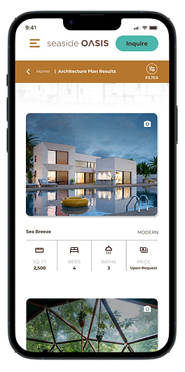
AFTER

THIRD MAJOR IMPROVEMENT
-
Adding an inquire button at the bottom of the plan details page helps make it easier for users to access help and speak to someone at the peak of their interest.

7. Final Prototype
MOBILE


DESKTOP
"Crystal has a remarkable combination of warmth and empathy, alongside being driven and focused. A company would add substantial value to their organization by bringing her to a role that utilizes her many strengths."
— Grace Pineda • EVP of Franchising at Xponential Fitness