Pivoting to online fitness
ClubCal was a brick and mortar gym where people could train using calisthenics in Denver. However, after only two weeks of being open to the public at the beginning of the COVID shutdown, the gym was forced to close. During this time, ClubCal pivoted to a subscription-based model and focused on creating content for follow-along workouts.
I was part of an ambitious project to redesign the e-commerce sales and membership sites so that the offerings were straightforward.

ClubCal
MOBILE-FIRST WEBSITE
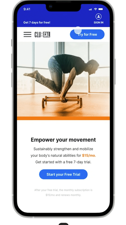
Bringing sustainable strength and mobility to online users with follow along workouts.
Due to COVID we've entered an age where at-home fitness products are literally everywhere. Users want a fitness program that will help to increase their quality of life and be able to do all of the things that life throws at them, whether that's outdoor activities, learning new skills like handstands, picking up their grandchildren, weeding the garden, and feeling less pain while at the computer. They want all of this along with the convenience to workout from home.
ROLES
I collaborated with my team of stakeholders and coaches and managed content creation.
-
UX/UI Designer
-
IxD Designer
-
UX Research
-
Post-production video design
DELIVERABLES
-
Responsive web design
-
Competitive analysis
-
User interviews
-
Persona discovery
-
Task and user flows
-
Site map
-
Wireframing and testing
-
High-fidelity prototypes
-
Final website build
SPECS
-
Figma
-
Miro
-
Indesign
-
Photoshop
-
Illustrator
-
Zoom
-
Wix


1. Research


SCREENER
The research participants have the primary characteristics:
-
Age 25-70
-
Fitness-minded or looking to place an emphasis on it.
-
Those who prefer working out at home or on their own time at the gym.
-
Users who have had injuries or are looking for more sustainable training.
project goals
At the outset, we had a few goals in mind for the business. I decided to use a Venn diagram to distill these goals further and ensure we were on the right track. I placed our business goals in one circle and user goals in another–which I discovered through foundational research using user interviews. Naturally, common goals were revealed in the intersection.
-
Help users get strong and train sustainably.
-
Iterate on the current Sales Page UI/UX so ClubCal's offering is straightforward with a direct and easy sign-up.
-
Eliminate confusion with the offering, so users feel confident in trying ClubCal.

methodologies
One-on-one interviews on Zoom and in person allowed me the opportunity to conduct foundational research. I set aside 30-45min to interview each user, watching for body language and personal anecdotes.
Market research helped me to understand what was currently successful in competitors and then see what opportunities there were for improvement.
market research
Because the online fitness niche is saturated, I wanted to explore what was currently successful in competitors and then see what opportunities there were for improvement.


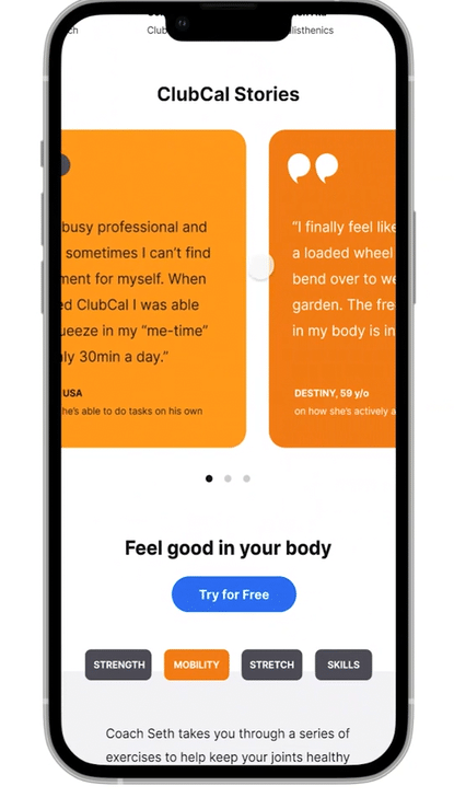
After synthesizing the research from the competitive analysis, I noticed a common theme. They had effective exercises and a good class selection, but their products were unapproachable.
User interviews
To better understand my users' needs, behavior, and motivations, I asked some key questions.
-
How important is it to move your body each day?
-
Take me through a typical day, starting with waking up
-
What's the biggest hurdle to working out?
-
What pricing looks the best to you?

RESEARCH synthesis
As I synthesized the research, I found three distinct and unique themes emerge, thus helping me to define my user personas.


How might we help busy, fitness-minded users train systematically and sustainably so they can continue to live their best lives?
KEY FINDINGS
All of the research participants really did and do have the best intentions when it comes to their fitness. They just have different obstacles and needs when it comes to making it work and fit into their lives.
insights
-
Should be fun and accessible
-
The program should be easy to access from their phone and able to do anywhere
-
There is information overload on what programs will be right for them
-
Users want to have a clear path of getting stronger or meeting their goals
takeaways
These user personas are more likely to workout when it easily fits into their routine, is engaging, is easy to access and offers a free trial.
2. Information Architecture
Before building the IA, I needed to understand how users would intuitively navigate the site. I tested this by using a card sorting method with 10 participants to help inform my design strategy in creating the site map, task, and user flows.
Because I used an Open Sort method, I found that people sorted things in quite a few different ways. It made it difficult to distill, but I appreciated seeing what users would naturally do without being directed.

CARD SORTING CHART

SITE MAP

3. Interaction Design
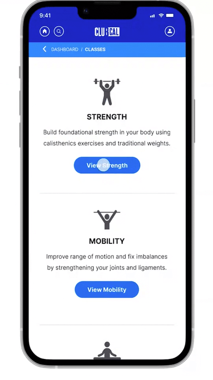
Because the goal for this website was making it accessible and easy to capture the users interest straight-away, I decided on the following flows.
USER FLOW

-
Signing up for a free trial and entering the signup details
-
Logging in after signing up
-
Finding and viewing a class
TASK FLOW

WIREFRAMES
Before I created the high-fidelity mockup, I wanted to go back to pen and paper to develop quick wireframe sketches. The task and user flows provided a map to follow as I built these wireframes.


5. UI Design
COLORS & TYPOGRAPHY
I chose a complementary color palette using these goals to guide the brand's direction. The combination of blue and orange hues perfectly combines joy and strength alongside the cool blues of honesty and sustainability. I chose the font Inter for the clean lines and readability on screens.


STICKER SHEET


6. Iterations
USABILITY TESTING
With the high-fidelity prototypes completed, I returned to my users and tested the different flows over Zoom.
SUCCESS METRICS
Overall, I found that my participants were happy to interact with the flows and enjoyed the interface's simplicity when handling each task. Participants could easily navigate through each specific flow and complete each task in under 30sec.
-
Users were excited and happy to interact with the flows (I watched for non-verbal cues, and I asked them how they felt)
-
Users felt confident in navigating through each specific flow (users didn't ask me for help after I asked them to do each task)
-
Users made no errors while navigating through the flows (users filled out all the required info on the forms and user interactions)
-
Users took no longer than 1-3 minutes to complete each task (users spent 15-30sec on average to complete each task)
-
Users could complete each task (users were able to go through each task with no problem)
FIRST MAJOR IMPROVEMENT
Simplification of header icons and breadcrumbs:
-
I learned from my users that they were searching for a more universal “home” icon to show the dashboard home.
-
I changed the icons so they change to an “active” state once on their corresponding page (home, profile).

SECOND MAJOR IMPROVEMENT
SKILL OF THE MONTH
-
After working with my prototype and testing it, I added some different features so that the Skill of the Month would look different than the “Classes and Series” section.
-
I designed the prototype with the ability to add check marks to the Classes the user completes, so they have a sense of progress and accomplishment.

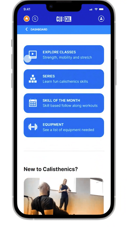
THIRD MAJOR IMPROVEMENT
EQUIPMENT SECTION
-
After observing my users and their questions, I added an equipment section for all the follow-along classes.

TOOLTIPS
-
I also wanted a way for my users to see what equipment they would need quickly at a glance from each of the classes with clickable tooltips.
-
Adding tooltips instead of other visible elements helped to simplify the design without losing functionality.

FOURTH MAJOR IMPROVEMENT
-
When asking users what they missed most about their in-person classes, they said community.
-
Because I eventually wanted to create a forum and the ability to allow for more communication between members in future iterations, I added a profile and comment section to each class so that the users would feel more connected.

7. Final prototype
After iterating upon user feedback, I now have a fully-functional prototype ready to be sent to my developers.
Takeaways
WHAT I'D DO DIFFERENTLY
Working through this project from start to finish taught me the importance of patience and working through how each element and feature will contribute to the final project.
I would have been even more divergent in my thinking without trying to nail down my constraints immediately. So I think this project was different because ClubCal already has a membership site, and our development team cannot do many of the features I designed because it's out of our monthly scope.
I would have spent more time prototyping with my users when my wireframes were in their low-fidelity state to gain more insight into what I may be missing early on.
IF I HAD MORE TIME
-
Add a workout builder - allowing members to create their own workouts.
-
Include gifs for each exercise so they don’t have to watch the full video to see how to do an exercise properly.
-
Implement a forum and the ability to comment with one another.
-
Include filters that allow members to search for classes with certain types of equipment, coaches, types of skills, etc.